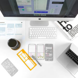
If you know anything about web design, you’re likely to be aware of Material Design. It is a design language first launched by Google in 2014. It is an expansion of the ‘cards’ motif you’ll find on many smartphones, operating systems and websites, as it makes use of grid-based layouts, smooth transitions and responsive layouts.
In its roundup of the web design trends to look out for in 2017, Econsultancy discussed ‘meaningful motion’. This is one of the main principles of Google’s Material Design, described by the search giant as follows:
“Motion is essential to bringing digital products to life. Something as simple as tapping a card to expand and reveal more information is made better by fluid animation. New content is introduced, shared elements move into their new position, and the user is given guidance with a clear focal point.”
How to master meaningful motion
In order to make use of this design concept to improve your website and the experience it provides to users, it’s important to understand what makes it effective. Google emphasises that motion in web design should be:
- Natural – mimicking motion, friction and gravity in the real world. Just as objects don’t always instantly speed up or come to a complete stop at a moment’s notice, the objects that move on your website should do the same. Google designers describe it as “gaining velocity or easing into a resting state by following an arc rather than a straight path.”
- Useful – intuitively guiding users to the right information at the right time. This is the whole purpose of motion in material web design, to make websites easier to use and help users to overcome complex challenges.
- Elegant – motion should always be smooth and beautifully designed, never clunky or cumbersome. It should solve problems rather than add complications, and make logical sense. Overall though, it should add to the feeling and functionality of the design framework.
Examples of the concept
Google has many examples of how its designers have made motion meaningful, but here are just a few ways you can make use of it:
- Exceptional photo galleries. Photo galleries can be tough to get right, especially if there is any element of user interaction. Making use of motion to make it simple to view, scroll and edit photo galleries could be a smart thing to focus on in 2017.
- Transforming icons. Tumblr’s app won a design award in 2015 for its use of motion, which included the transformation of a button when selected. For example, a ‘create post’ icon transforming seamlessly into a ‘cancel’ icon as the next screen appears. This creates a smooth, seamless experience for the user, as well as adding bags of style.
- Expanding content blocks. Users will thank you if they can access further content, such as a descriptive sentence or link when clicking on an image, without having to load a new page. This can be achieved by using motion to slightly enlarge and expand a content block.
Will you attempt to master meaningful motion this year and if so, to which parts of your website or app will you apply the concept? Please feel free to share your thoughts.